Hello everyone!
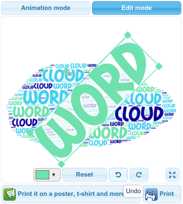
Today we are excited to present a new functionality in Edit Mode - Undo / Redo.
It makes much more convenient to work with Edit Mode as you don't need to manually undo a movement or resize if you made a mistake.
Hope you enjoy it!
Have a nice day!

Comments (3)
I love Tagul it is fun when u make ur own thing
I just wanted to share a few thoughts I had after playing with this awesome and cool tool.
With the number of words we have and the rest of the search results page, straight and even horizontally seems best. Along the same lines having random colors seems a little loud as well. And having a relevant shape also seems to make a big difference and attract the users attention.
It's also important to have the queried term be significantly larger and bolder than anything else or the rest of the pack. It gives it more focus. An image with fewer colors in larger blocks seems better but a couple colors is a little better than just one. A more horizontal image is better than a vertical one. And thicker lines or shapes is better than narrower lines. The size of the original image doesn't matter and the simplicity of smaller icons seems to work better than larger more elaborate images. Simpler block images that are solid are better outlines and mostly lines. The image doesn't have to be exactly the word and can just be related to the theme not the exact word or phrase.
These are a few of the things I've learned in a few hours of playing with it, that I thought I'd share. Other applications will probably find different things. For instance more vertical or even random directions are better if it has a lot of vertical lines, or if you have fewer words and want it to be more the center of attention.
Cool
Comments are closed.